


48 freight
Logistics freight brokerage was designed to reflect the company’s focus on nationwide delivery across the continental 48 states. The letter 'F' is cleverly stylized to resemble a waving flag, symbolizing movement, progress, and the dynamic nature of the logistics industry. The fluid lines within the design evoke the idea of transportation, while the flag-like shape emphasizes the company’s commitment to reliability, speed, and nationwide reach. The clean, modern aesthetic ensures that the logo is both professional and instantly recognizable, making it a perfect fit for a business at the forefront of freight brokerage services
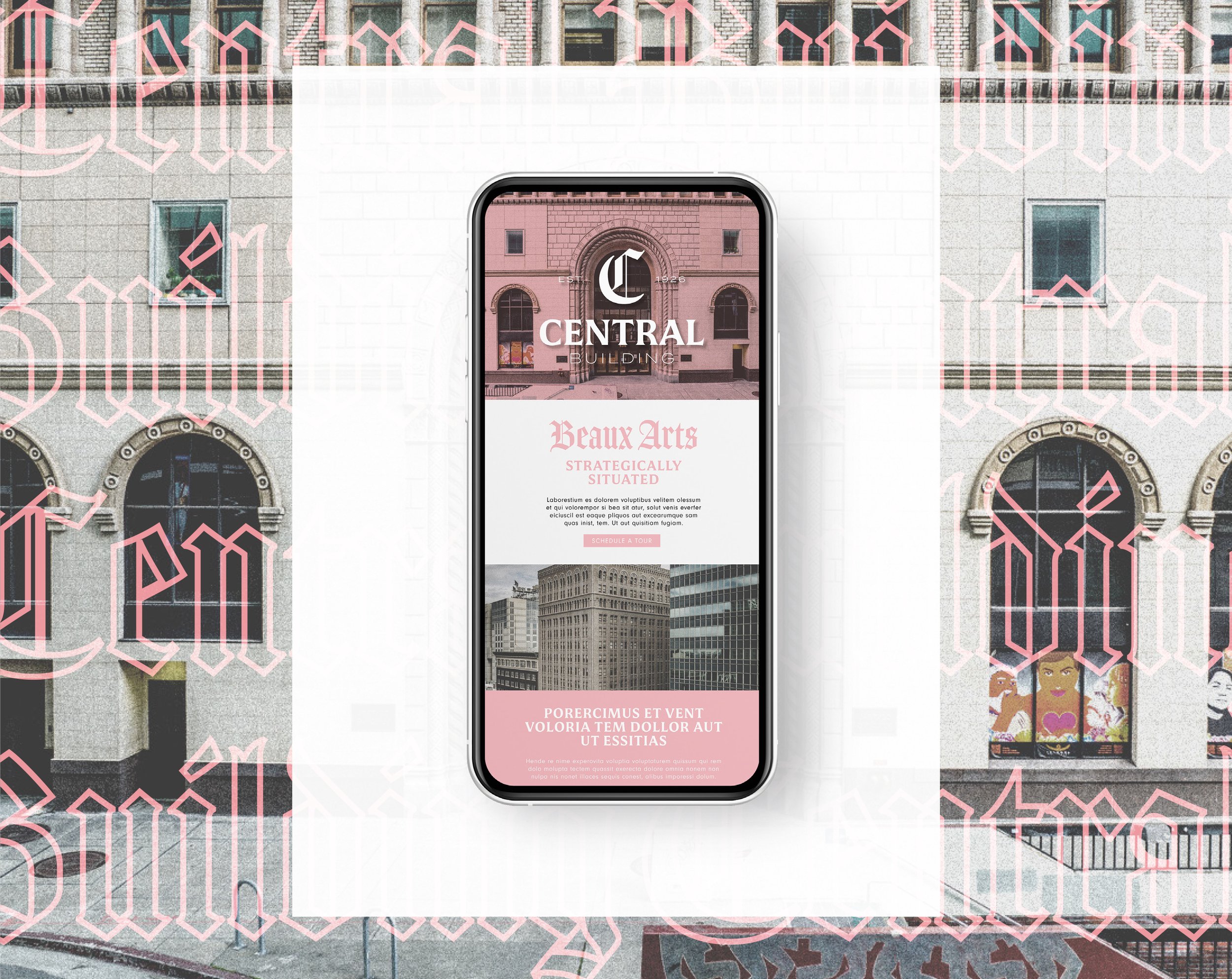
central building
The Central National Bank Building is a sixteenth story (15 story and a mezzanine) steel-frame and reinforced concrete Beaux Arts skyscraper, rectangular in plan, on a southwest facing corner lot. It was designed for a bank in its base and mezzanine levels, with offices above. Central Building’s rich heritage and enduring presence. The juxtaposition of the ornate Blackletter ‘C’ with sleek serif and sans-serif fonts creates a visual narrative that spans from the building’s establishment to its present-day significance. This design evokes the prestige, positioning the Central Building as a timeless icon in Oakland’s architectural landscape.
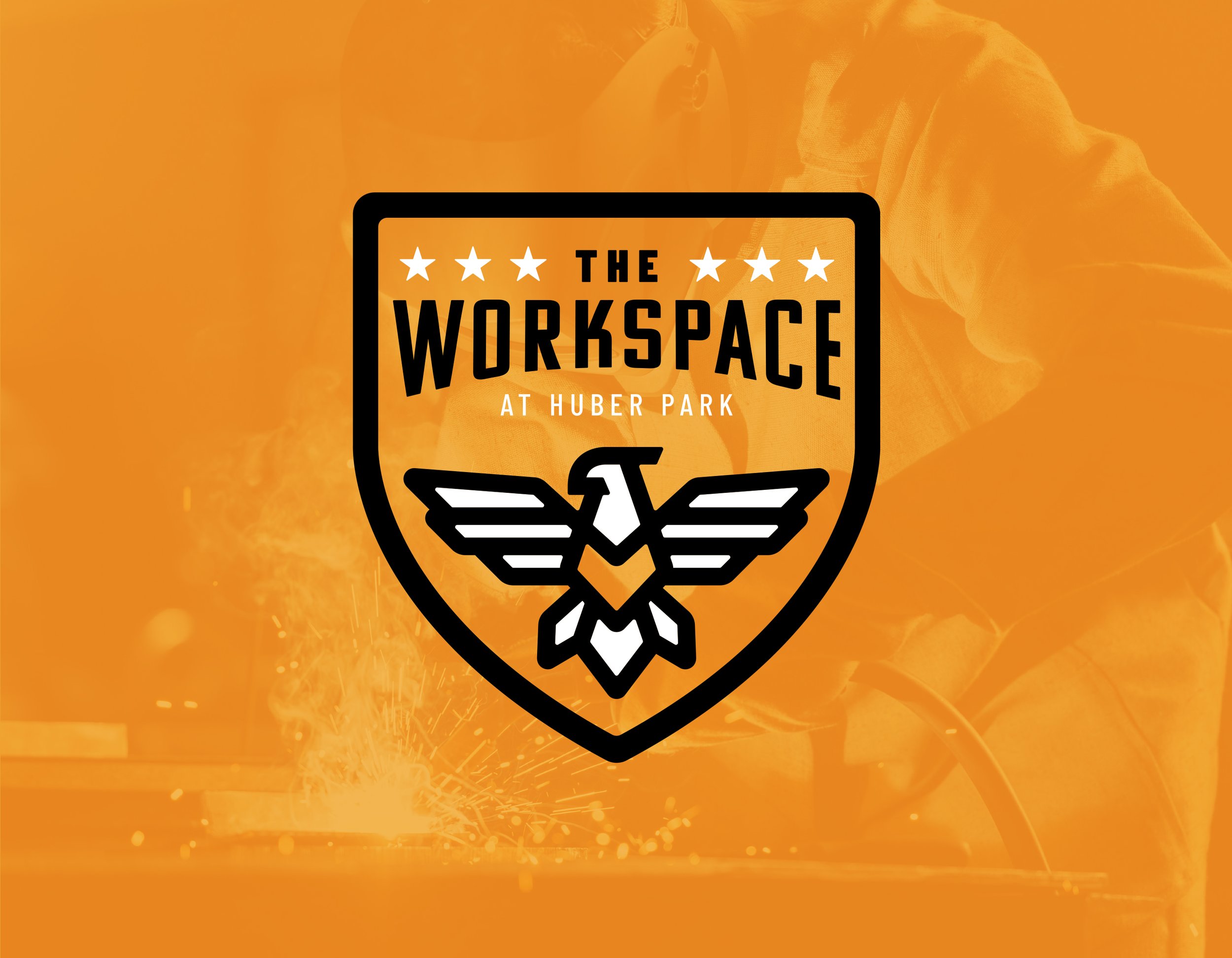
the workspace
The Workspace at Huber Park, a cutting-edge climate-controlled flex space, a joint office and warehousing solution, offering flexible, scalable, and technologically advanced storage solutions to meet the evolving needs of businesses worldwide. With a focus on adaptability, efficiency, and customer satisfaction, we provide a dynamic platform for small business owners and hobbyists seeking agile office and warehousing solutions. Each unit will have the option for office space, warehousing, loft space and bathroom amenities.
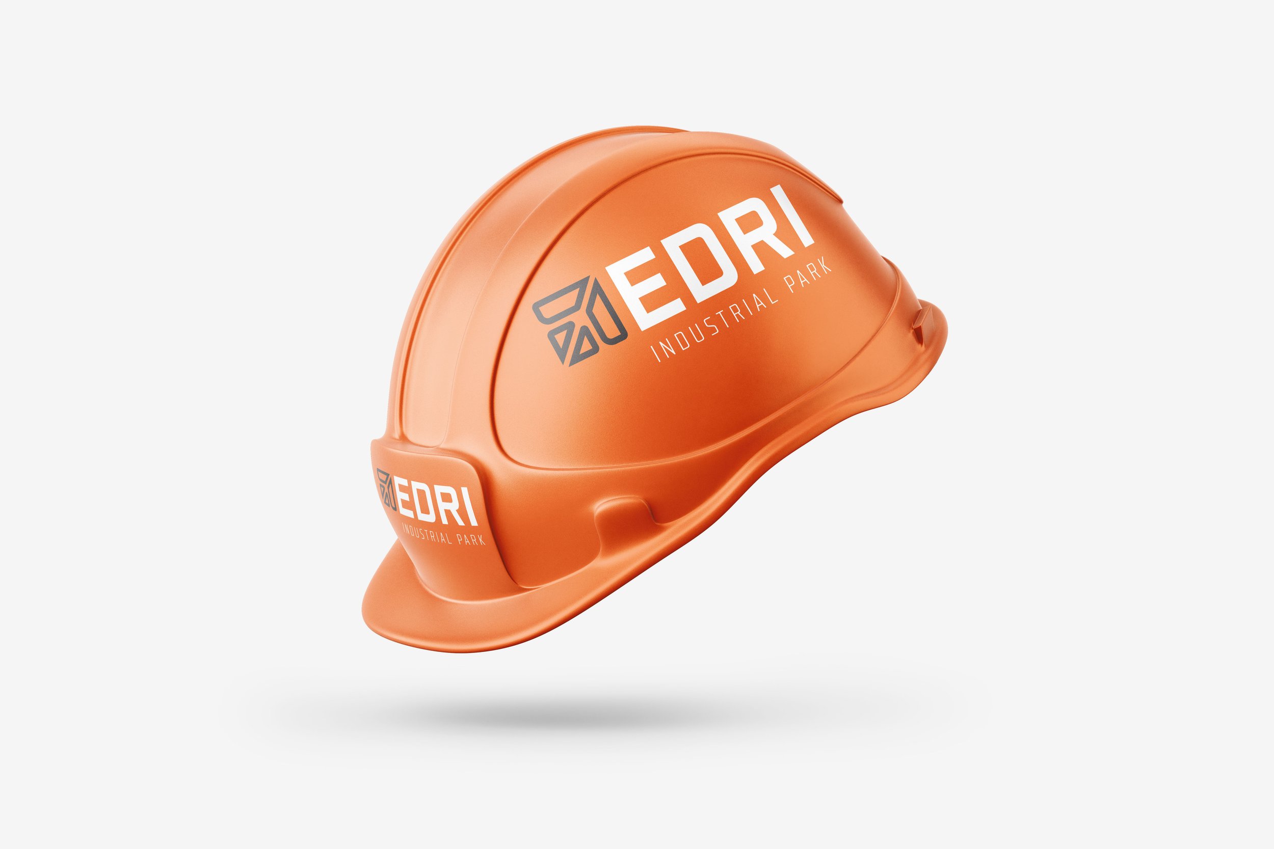
edri
Branding for this 131-acre land listing in Aurora, CO, draws inspiration from the proximity to Denver International Airport, emphasizing the site's strategic location for future development. The logo features an industrial-style sans serif font, which conveys strength, professionalism, and the land’s potential for commercial growth. Accompanying the text is an icon that cleverly incorporates the shape of an airplane, symbolizing the connectivity and accessibility provided by the nearby airport. The design strikes a balance between modernity and functionality, creating a unique and memorable identity for this land project while maintaining a distinct personality separate from similar developments like Porteos.
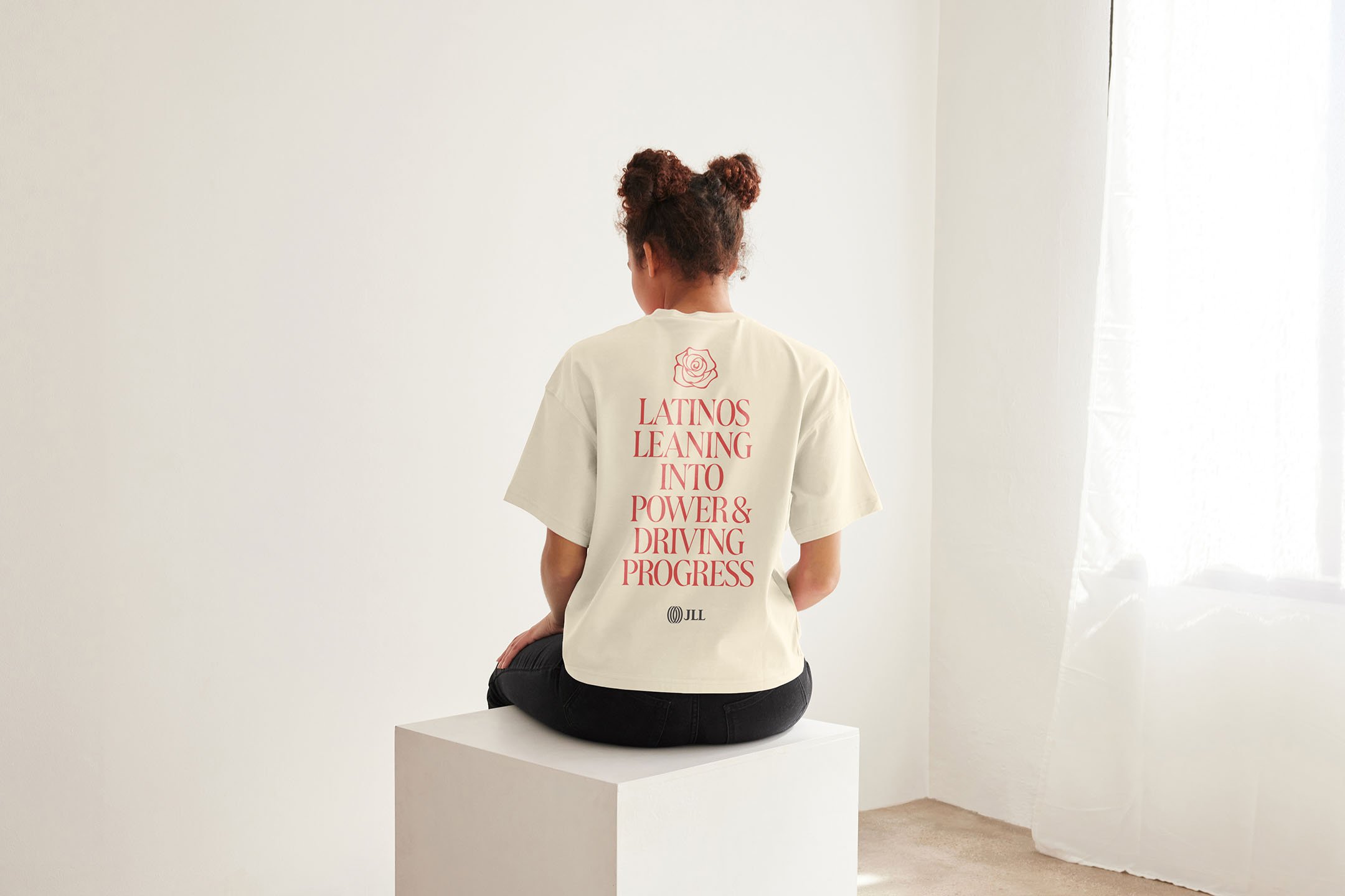
hispanic heritage month
The design for the Latino Empowerment Resource Network’s t-shirt celebrates Hispanic Heritage Month by blending cultural pride with modern design elements. The shirt features bold, vibrant colors and intricate patterns that reflect the rich history and diversity of the Latino community. The typography is sleek and contemporary, showcasing the spirit of empowerment and unity within the organization. The design not only honors Hispanic heritage but also fosters a sense of belonging and pride among its members, making it a symbol of both celebration and solidarity within the JLL community.
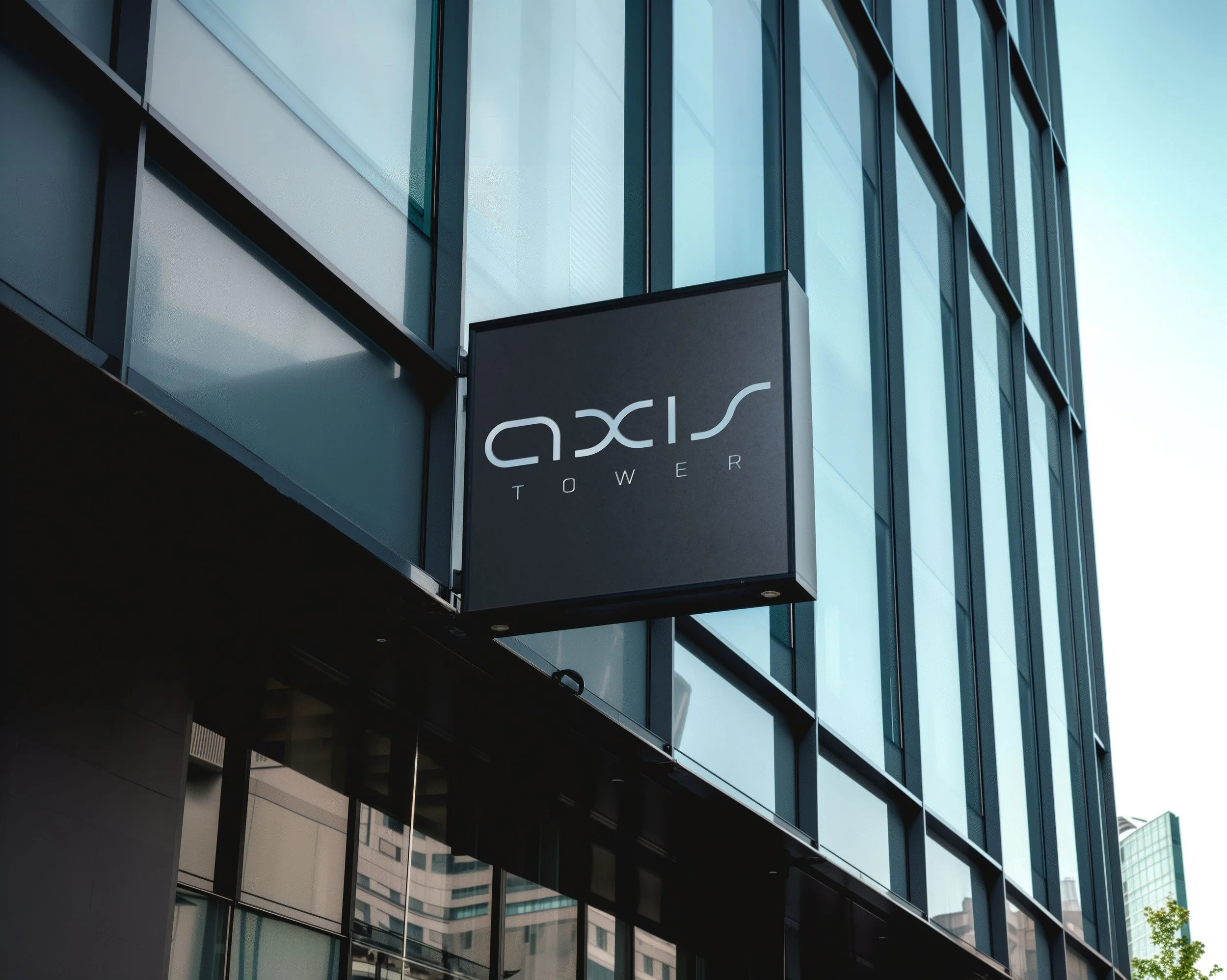
axis tower
The logo for this office tower in the Denver Tech Center draws inspiration from both the location and the concept of 'Axis.' The design incorporates a sleek, modern aesthetic that reflects the straight lines and symmetry of the Earth's axis, subtly representing the tower’s structure. The use of bold, geometric shapes creates a sense of movement and stability, while also alluding to the towering nature of the building itself. This logo strikes a balance between sophistication and approachability, offering a fresh, fun take that aligns with the younger generation of clients while appealing to traditional office tenants.